Showing posts with label Champion Revision. Show all posts

Friday, August 2, 2013

Revision: Castor/Pollux


Art Direction

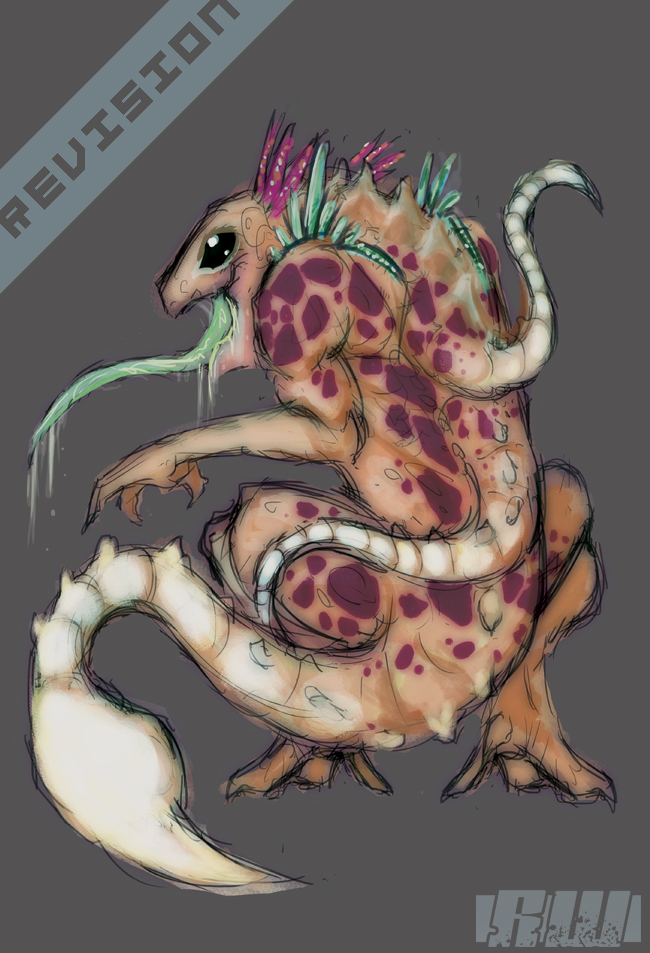
The long awaited Castor/Pollux revision is here! Going off of the feedback I received from the original versions -- this Champion is now a mirror of the Summoner's Rift minions.  This all ties back to an attempt at duality -- and as such, Castor and Pollux both represent two different kinds of minions.  Of course, they're their own champion, so they're a little more "beefed up" than the minions.  I think they share enough resemblance to get the idea across.  Also, Castor and Pollux are different enough from each other to dictate how they play differently depending on which one you are playing.  One's a hero, one's a villain -- and they're both very childish about it.  Hope you enjoy the revision![

Friday, July 26, 2013

Revision: Elle


Art Direction

Not to toot my own horn -- but it's amazing how far along I've come being able to draw the figure. I was never happy with how Elle turned out -- the themes I wanted to convey worked against me. I had to bring her more in line with a traditional woodland elf. At the same time, I needed to add a little more League flavor to her. There are more vibrant colors used in Elle's design now, so that she stands out and conveys "Elf" to the player. Disregarding the conflicting concepts, Elle's mechanical arm is now a mangled growth of roots that acts as her new arm. This affects her lore a bit -- but like all the concepts, nothing is set in stone.

Sunday, March 3, 2013

Revision: Shiori

Art Direction

I updated Shiori's outfit a tad bit -- very small revision.  She now has a pattern in her garb and it also make her stand out a bit more color-wise without toning down her feminine aspects.  This was a quick fix to make (as it was actually supposed to be the original) but I wasn't sure if it made her to visually busy.  I like the change, and hopefully you do too.

Monday, February 18, 2013

Revision: Warin

Art Direction

So, a big problem I had with Warin was that at the time I made him, I was still really bad at textures. I still don't consider myself great at them, but I've gotten better. To reiterate Warin, I moved his design from heavy reds and steel because -- as someone mentioned -- he shared too much of a similarity with Darius. This time around, I've made Warin a creature with more exposed bone plating. I also thinned his frame a bit and expanded his shell. This was to give him more of a heroic silhouette. The bone plating helps adjust his color too, so he no longer reminds us of Darius. At the same time, I took care to make sure that he didn't remind people of Malphite either. This is why the shell forms a hard V shape.

Saturday, February 2, 2013

Revision: Waitomo

Did you feel that Waitomo was too cute? I did.  So I creepy'd him up a lot.  This revision was a little overdue -- and I wanted to really really push Waitomo into an appropriately awesome League-worthy appearance.

So Waitomo's body has been slightly elongated to play further upon his "skittery" nature.  His luminous tails have been sharpened so that you know from looking at him; this character is an assassin.  His color palette has been switched up -- and this was to give him a more sickly look.  His eye changed from a high reflection to an empty pupil.  I also opened his jaw and revealed his disgustingly mucous-filled mouth.  So now Waitomo is still this highly exotic magical creature, but he's still something from the dark that plays upon being something of a stalking character.  The main influence for this rework was X-Men's Toad.

Revision: Rhodes

So here's a quick revision of Rhodes.  There was very little feed back on Rhodes from the thread -- but I pulled some quick points.

To start -- Rhodes' hammer is much more part of the character, and it's a little stylized to give a "heavy magic" feel to it's appearance.  The earthy gems have been pushed a little higher in color to contrast the armor.  The armor itself has been simplified and smoothed out -- because combined with the gems, Rhodes still reads as tough and tanky.  I also gave him some war paint -- I think it makes him more badass and it pulls a bit from his lore as a mercenary from the jungles.  Rhodes himself is a little shorter, but he's a little more built too.  He'd still be a beast in the League, but now he doesn't come off as being like Bolaji Badej in height.

Monday, December 24, 2012

Revision: Elle


Did I mention I hated Elle's scarf? I knew how I wanted the scarf to look -- and I just couldn't illustrate it at the time. So over the weekend I took Elle and decided to sit with her until she had a scarf I liked. This is quite a minor revision, but I think it makes a huge improvement.

I also added additional details and added better quality shading and highlights. Ever-learning. Stay tuned for additional content tonight.